Enhancing Your ART…Make the right choices!
WHAT IS A MAT and What is its use?
- It rests on top of the artwork and is like a protective spacer between the art and the frame protecting the art work from touching the glass. You always want to choose the matting color first before the frame. The matting should enhance the art work and not compete with it. In some cases you have probably noticed matting color competing with the art work. Your eye goes to the mat color first, rather than focusing on the art work. It visually takes away the most satisfying beauty of the art……simply because the wrong color was used. It fails to enhance the art.
- The matting should never be darker than the darkest part of the art or lighter than the lightest part. Matting is used on watercolors, drawings and in some cases, pastels. (Lately, pastels have been also being framed with only a frame and using a spacer between the glass and the pastel art work. Matting is still used on pastels though as well. It is only a matter of choice.)
Types of Matting
The type of matting you use is important also. You do not want those mattes to buckle or fade.
Plus, when you use the wrong matting, it will leave a mark on your art work over the years. This type of non-acid matting is wood pulp that has been chemically neutralized to the right pH, but is not non-acidic. Usually you can tell within a year by looking at the color of the inside angled cut of the matting…it will have turned orangey which is acid. That is what will mar the art work with time.
Acid free cotton-rag mats is what should be used.
- Select a color in the art for the matting that is to be used and will go well with the typical decor of a home or office. Sometimes two mats are used with the inside mat complementing the art work and the top matte complementing the room colors. BUT still, that doesn’t mean going with too much color. A neutral colored mat is always best for the art and for the decor of a room.
- Do not think that the art has to match the room. It doesn’t. People make that mistake many times. The best thing to do is buy the art work first and then decorate around it taking colors from the art. The framing always has to be right for the art work.
- A wide mat with a wide frame can be used on a small art piece. BUT, Do Not put a small mat on large art. It will look squeezed in and take on a claustrophobic appearance. Art does need room to breathe and it will be fighting to get out of that mat and frame. At least every time that you look at it, the art work will seem like that.
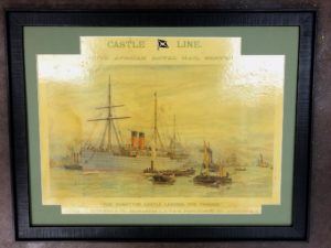
Black and White Photography 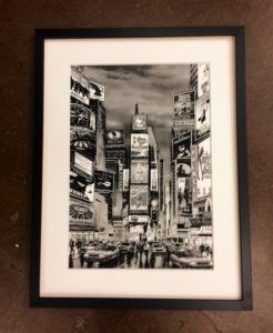
People often wonder what to use on black and white photography. Again it is best to use neutral matting such as gray, white and different black values on a black and white photograph or drawing. That goes the same for the frame. In juried art shows, judges usually prefer neutral top mats such as white, off-white or cream. There can be a bit of color in the underneath mat if using doubled matting. You can also use a fillet on the inside of the matting which can give a more finished, refined look to the art piece. Fillets come in all kind of finishes to match the frames. Although a simple designed fillet looks best.
The frame should never detract from the art. A simple frame is best used on watercolors while a more ornate frame can be used on oils. When decorating a more formal room with art work, using more formal frames. Frames come in all kind of styles and finishes, from simple to ornate…from modern to traditional to rustic and much more. BUT, the framing MUST ALWAYS work with the art first, and then fit the decor of the room.